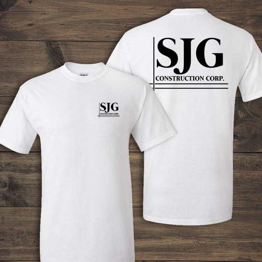
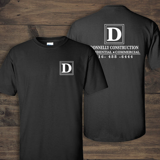
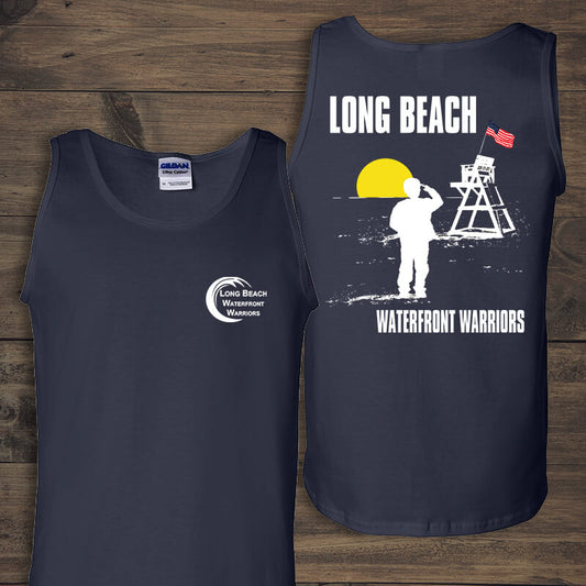
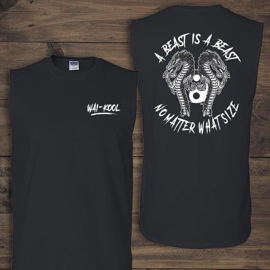
Five Design Elements to Avoid When Ordering Screen Printed Clothing
Alexis V
Sometimes clients send us artwork that we have to tweak. We're happy to do it, but if you're in a rush to get your order, this additional back and forth might cause an unexpected delay. In hopes of solving that problem, EZ Corporate Clothing has compiled a list of the top five design elements that you'll want to avoid when creating artwork for custom screen printed clothing.
1. The colors shouldn't touch or overlap. Screen print is essentially paint, so unless you want green somewhere in between your yellow and blue print, we recommend keeping your colors separated.
2. Negative space is your friend. Again, because of it's paint-like nature, screen print tends to expand a bit on the garment, making small spaces even smaller or completely non-existent.
3. Choose the right kind of shading. You'll want to stay away from drop shadows but gradients, though more time consuming to create, are fine.
4. Be wary of images you find online. First, you'll want to make sure you can use any images you find on the internet legally. Second, these images probably won't be of a high enough resolution for screen printing because website developers try to keep images small to help with load speeds.
5. Careful Color Choice. Neon print is very popular now, but it sometimes fades on darker fabrics. What other concerns do you have when ordering screen printed apparel for your business, recreational sports team, or other club/event? Let us know in the comments and we'll try to address it! -Michelle Giuseffi